Our website is made possible by displaying online advertisements to our visitors.
Please consider supporting us by disabling your ad blocker.
OCR-A
| Category | Sans-serif |
|---|---|
| Designer(s) | American Type Founders |
| Commissioned by | American National Standards Institute |
| Date released | 1968[1] |
| Variations | OCR-A Extended |
 | |
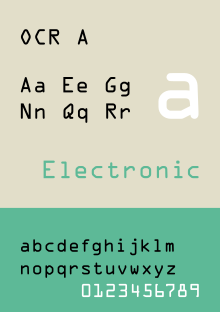
| Sample | |
OCR-A is a font issued in 1966[2] and first implemented in 1968.[3] A special font was needed in the early days of computer optical character recognition, when there was a need for a font that could be recognized not only by the computers of that day, but also by humans.[4] OCR-A uses simple, thick strokes to form recognizable characters.[5] The font is monospaced (fixed-width), with the printer required to place glyphs 0.254 cm (0.10 inch) apart, and the reader required to accept any spacing between 0.2286 cm (0.09 inch) and 0.4572 cm (0.18 inch).
- ^ Background on the OCR-A font from Adobe
- ^ National Institute of Standards and Technology (1981). American National Standard Character Set for Optical Character Recognition (OCR-A) (PDF). ANSI X3.17-1981. American National Standards Institute, Inc. p. 3.
The OCR-A character set for optical character recognition was first developed in the United States in 1961 as a numeric font only. In 1966 an alphanumeric font which contained 57 characters, including the existing numeric font, 4 abstract characters, and only capital letters, was issued. The revised standard was entitled American National Standard Character Set for Optical Character Recognition, ANSI X3.17-1966.
- ^ "OCR A".
In 1968, American Type Founders produced OCR-A, one of the first optical character recognition typefaces to meet the criteria set by the U.S. Bureau of Standards. The design is simple so that it can be read by a machine, but it is slightly more difficult for the human eye to read. OCR-A follows the 1981 standard set by the American National Standards Institute (ANSI), X-3.17-1981 (size I). The same design is also specified for the German DIN 66008 standard. OCR-B was designed in 1968 by Adrian Frutiger for Monotype. This design pushes the limits of the optical reader, but is easier for people to read. OCR-B's construction follows the ISO 1073/II-1976 (E) standard, with 1979 corrections (letterpress design, size I). Both OCR-A and OCR-B have "alternate" versions, which have the standard ISO-Adobe character set instead of the more limited OCR character set.
- ^ Motivation for OCR-A from Microscan
- ^ "Background on OCR from Embedded Software Engineering". Archived from the original on 2016-09-17. Retrieved 2012-09-01.
Previous Page Next Page


